

Researching bourbon bottles, I identified two main styles: classic and modern. While modern designs were visually appealing, they sometimes lacked bourbon's essence. Further exploration revealed a link between bourbon and Bluegrass Country music, blending modern aesthetics with traditional roots.


The discovery of Michael W. Smith's song, 'Kentucky Rose,' became pivotal. It tells the story of a preacher who gives up his life to save a child and afterwards only one plant will grow in the area, the Kentucky Rose. This became the cornerstone of my design narrative.
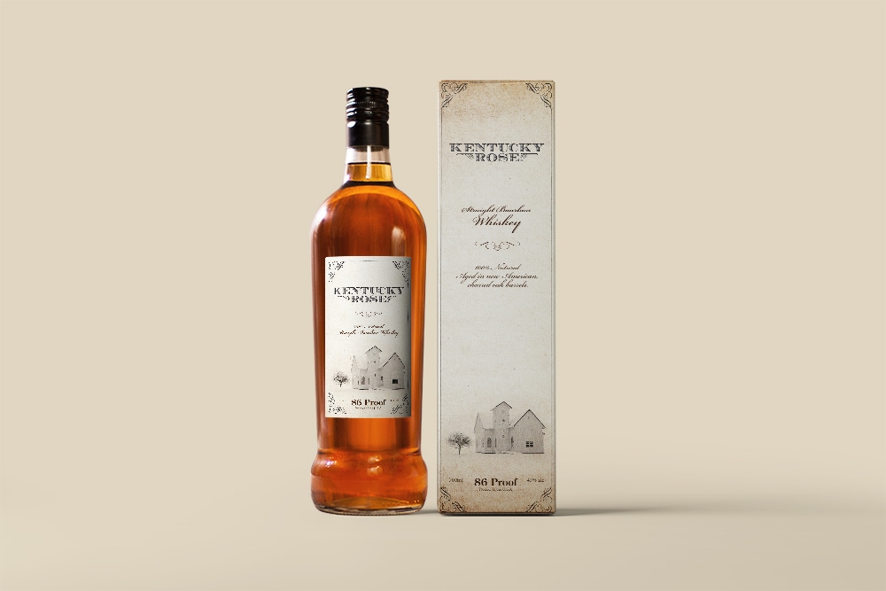
For the box, I incorporated elements from the song and bourbon heritage. A light-colored church and white snow symbolized purity and the preacher’s sacrifice. Delicate, worn flourishes framed the design, evoking the feel of hand-distilled whiskey labels.The logo took prominence, embodying the brand's essence. Subtle presentation of the whiskey's name and description in Bickham Script maintained hierarchy without overshadowing the logo.

Classic fonts like the quintessentially American serif Caslon Pro and Century Old Style added timeless elegance.Consistency was maintained in translating the box's aesthetic to the bottle. The front label retained iconic church imagery, with text placement echoing the established hierarchy. On the back label, I included lyrics to the Kentucky Rose song and a vivid rose image breaks the flourish border, creating a more interesting and appealing shape.
In crafting the branding and packaging for Kentucky Rose Bourbon Whiskey, I aimed to blend bourbon heritage with modern Bluegrass music elements. Attention to detail, typography, and thematic consistency underscored the storytelling potential of graphic design.